Project Overview
In December, our team was pulled onto a fast-moving initiative for the Department of Defense and Adobe: prove that a single, scalable platform could modernize thousands of outdated government websites. With Industry Week approaching in mid-January, we didn't have weeks to mock this up in Figma and hope it landed — we needed a working, clickable prototype that could demonstrate both a beautiful citizen-facing experience and easy backend content management, in days.
After we shipped that prototype, I turned the workflow into a repeatable framework for the broader design team — building training materials and hosting an internal design huddle to teach other designers how to move from concept to interactive prototype dramatically faster using AI.
The Problem
Outdated, broken citizen experience. Think DMV-website frustration: hard to navigate, forms that don't work, no accessibility built in.
Painful backend for government staff. Content authors were stuck in complex legacy CMS platforms requiring constant training and support.
Compressed timeline, high stakes. A traditional design-to-dev handoff for something this scope would normally take 2–3 weeks minimum — we had days, for an audience of DOD and Adobe decision-makers.
Project Opportunities & Goals
Rather than pitching this as slides and static comps, we reframed the challenge as: build something people can actually click through. The goal was a fully responsive, USWDS-compliant, accessible prototype that proved a single design system could scale across thousands of government sites — while giving us, the designers, more time for craft instead of production.
Our Process
Tools: VS Code + GitHub Copilot, Figma, html.to.design, Node.js
Day 1 - Foundation
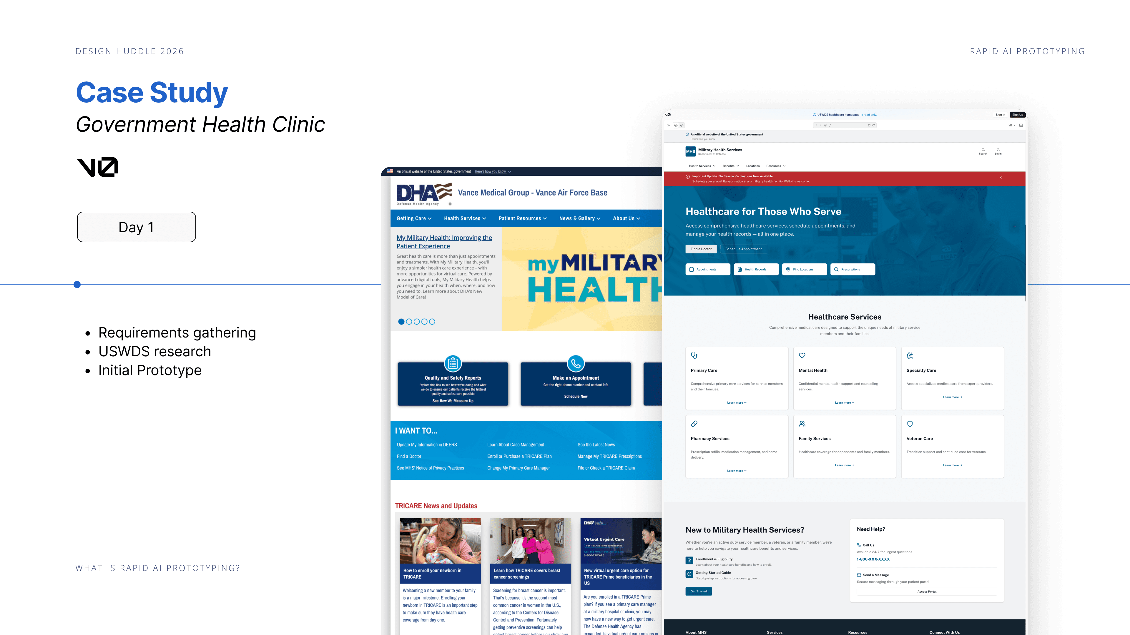
Requirements gathering and USWDS research, then a first prototype generated in v0 (hero section, service cards, core layout). We imported that into VS Code and, using Copilot, built out a fully responsive homepage with proper navigation and accessible components in about an hour — work that traditionally takes days in Figma, and still wouldn't be clickable at the end of it.
Day 2 - Build & Iterate
Expanded into a multi-page site: appointment booking flow, provider search with filters, News/Updates and About pages. Because Copilot had already learned our Day 1 patterns, new pages inherited the same header, footer, styling, and accessibility patterns automatically — no rebuilding from scratch each time. First team review happened this day, with same-day iteration on feedback.
Day 3 — Polish & handoff
This is where design judgment mattered most. Bringing the prototype into Figma for final refinement surfaced real issues AI couldn't catch: cluttered CTAs, typography that didn't match USWDS standards, and content gaps needing healthcare subject-matter-expert review. We closed those gaps, walked the final build through with development, and packaged the VS Code files as a direct foundation for developers to build from.
The framework that came out of it: AI gets you roughly 80% of the way there — structure, functionality, base visual implementation — in hours instead of weeks. Designers bring the remaining 20%: visual hierarchy, brand consistency, accessibility refinement, content strategy. Compressing the build timeline doesn't shrink the creative work — it removes the tedious work, so there's more room for craft, not less.